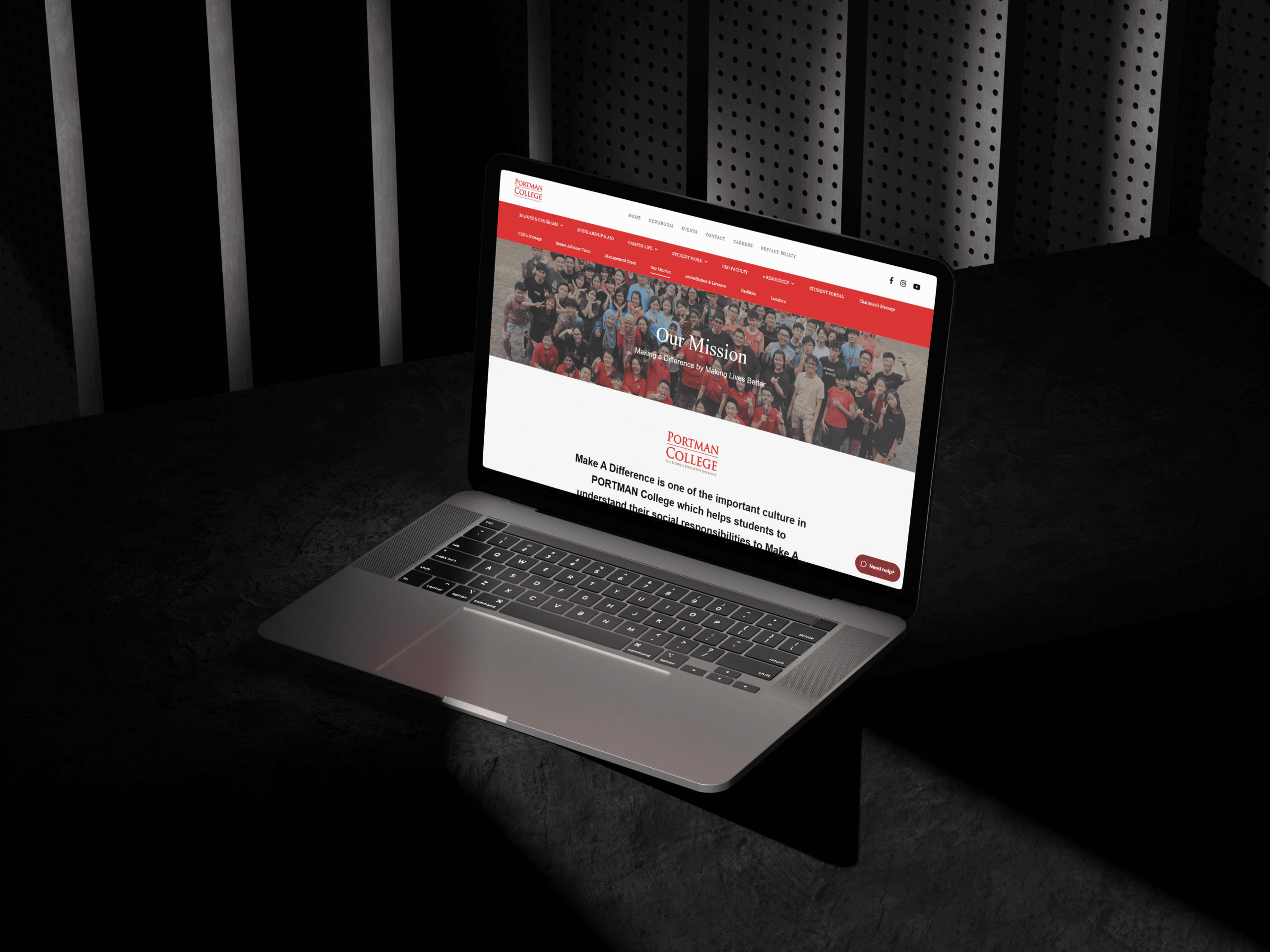
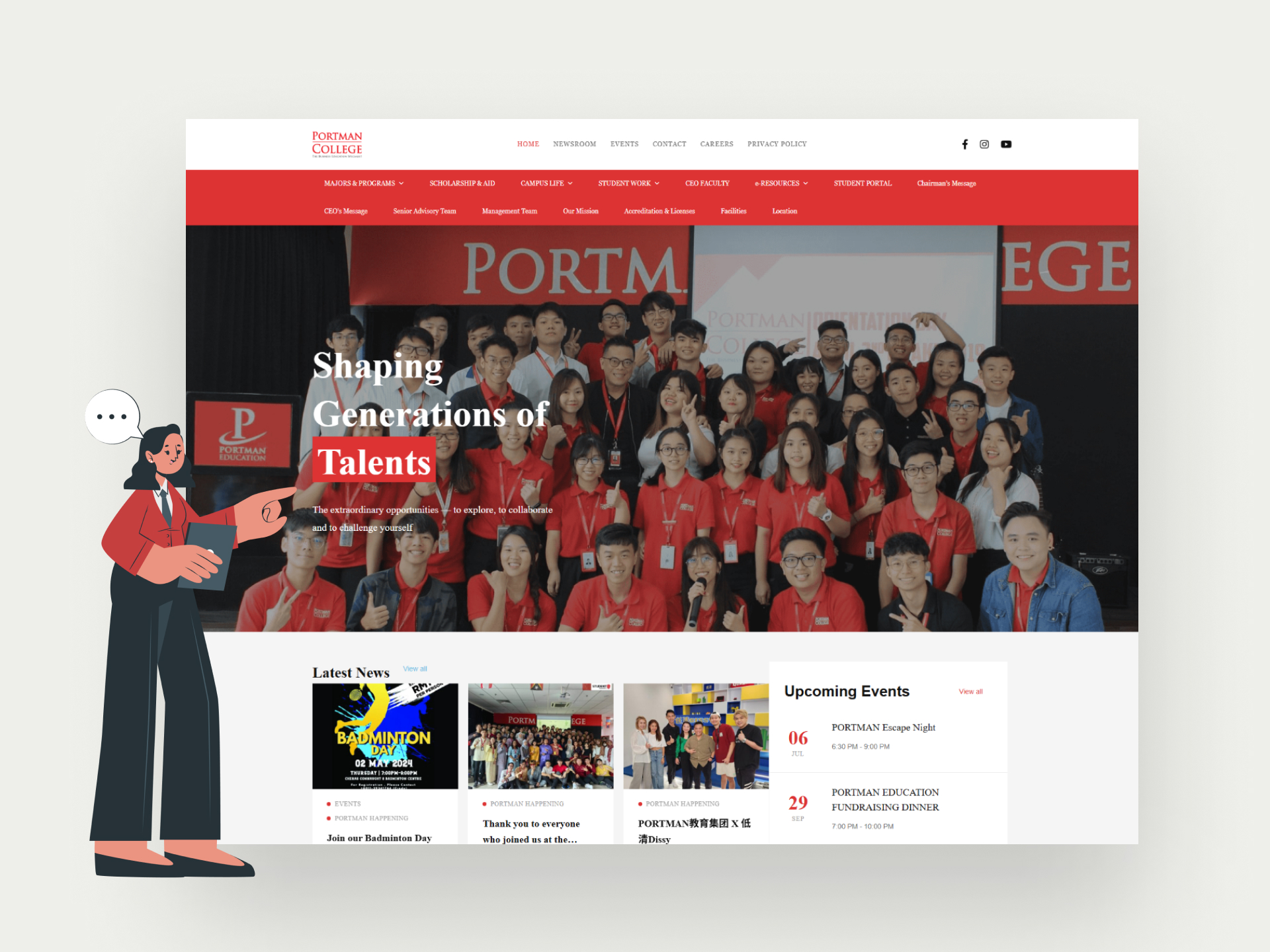
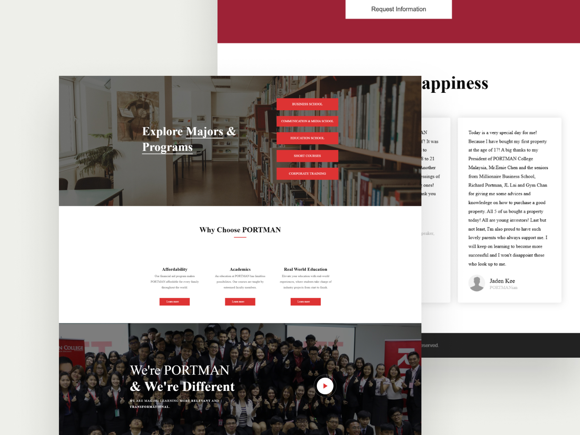
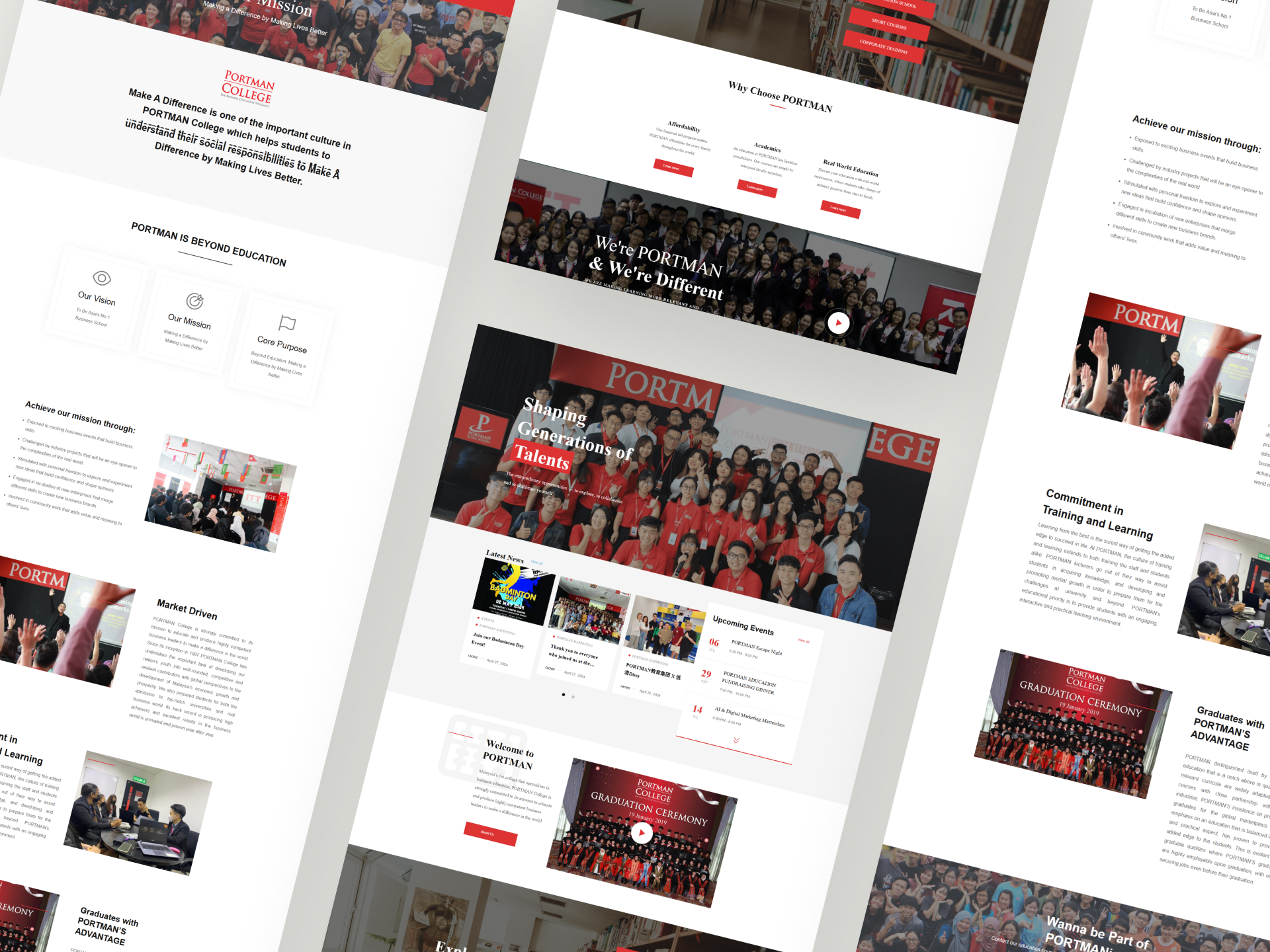
Ensuring the site felt like a serious business environment without losing the welcoming essence of a college community.
Organizing a massive volume of data—from course details and admission requirements to corporate partnership programs—into a clean, minimalist structure.
Leveraging the bold PORTMAN Red as a primary brand driver without it becoming overwhelming, ensuring it signifies power and passion rather than distraction.
Position PORTMAN as the unrivaled leader in business-specific education through a sleek, modern, and formal layout.
Optimize the user journey for prospective students, making the transition from “browsing” to “applying” frictionless.
Build a responsive, fast-loading platform that reflects PORTMAN’s international standards of excellence.